This Tutorial is for mid to advanced users; and assumes (at least) a working knowledge of Layers, Layer Masking, Layer Blend Modes, Custom Brushes and Brush Modes - although I will do my best to explain them, I am not explaining the mechanics of those techniques here.
I'll be demonstrating the technique I use when I'm doing one of my favourite things - freezing stuff. It isn't overly technical, but does involve a lot of use of digital overpainting, for which I use a Pen and Graphics Tablet. I don't know quite how you could achieve the same result using a mouse, but if you are comfortable with that, by all means try it out.
I'll take this little stone cairn:
and explain how to freeze it, so it ends up like this:
The first thing to consider is the overall look you want to achieve. Snow and ice as surfaces are highly light reflective, so it makes sense to involve the use of light for greater dramatic effect. I usually go for a nicely contrasting environment, so I'll go for a nice blue sky and cloudscape - further down the process, this will provide the opportunity for some great light and shadow details.
For contest entries on the Community pages, I usually always go for a dimension of 1000px wide by 1200 px high - this gives the best contest view. However, you can rarely find an appropriate photograph that meets all the requirements, so I here I'll build the scene first and fit the subject into it as I work. That way, you can add the important lighting details to the focal point as you work, having already established light and shadow values and direction. Nothing throws an illustration off faster than messing up basic details like light direction.
So, my first step is to create the environment itself. Relatively quickly, I pull together some landscape sources and skies:
The sky is overlaid above the ground layer, and a simple gradient mask applied blends it together. At this point I also desaturate both images (Image > Adjustment > Hue / Saturation) and bring some matching colour balance to both (Image > Adjustment > Colour Balance). I try to bring an overall cooling colour temperature into things here...
...until I'm happy they both look like part of the same image. Note that the desaturation and my altered colours bring out more blue and cyan - important to get that chilly feel we're after:
Now I have my background scene looking suitably frosty, let's get to work on the subject - I'm using a basic cairn image we recently saw in a B2B contest. I scale and position it on top of my scene (I find that reducing the opacity of the overlying layer helps here, so I can see where it sits comfortably on the background):
Then I cut around it with a basic layer mask. You don't have to do anything detailed here, just the general shape, because the refining the mask will form a major part of the work later on:
The next step is to make the cairn subject look as if it's part of the same scene as the background image, in terms of colour tone, temperature and hue. So as before, some judicious playing around with the colour balance and Hue / Saturation, and I get this:
For the record, because I'm dealing with stone here, you can see the background has a lot of brown in it at ground level, and that means although I add to the blue and cyan, I dabbled a bit with adding red and yellow before desaturating.
It still sticks out like a sore thumb, however. That's because the light isn't falling correctly. Although the shadows are in the right places, it's necessary to backlight the cairn a little where the edges meet the sky.
So I selected a soft edged brush, set it to 'Soft Light' mode, and sampled a very light blue from the sky to paint with. When you sample colours from within your own image as you work, it has the added bonus of tying up your colour values, making the final composite seem more comfortable.
With the opacity of the brush set to about 30% and as an airbrush, I began to build up some light onto the cairn by slowly painting around the left edge. I let this build up more at the top, where the strongest skylight would be falling:
It looks nice enough; but it's not dramatic, and dramatic is what makes your work stand out (and win contests). So using the same brush and the previously selected colour, I switch the brush mode to 'Colour Dodge'. Painting with your brush set to this mode has the effect of dramatically blowing out the image into a glow where your selected colour meets the same colour on the underlying image - so here, where I've painted 'Soft Light' blue, then overpainted with 'Colour Dodge' blue, you get a brilliant, glowing edge:
Now I realise at this stage it looks like I've gone too far with the light work; but that's because the end result here will be a totally frosty image, sparkling and frozen. What I've done so far is provide the basis for the final look of the snow and ice, and what we have to do next is build on that basis.
What I've achieved to this point is all very simple stuff - but it's vital for the outcome of the image. Matching colour tones for varying sources, understanding light directions, and gauging colour temperature is all pretty basic editing, technically; but once you've got it to the point where all your sources are sitting together seamlessly, in terms of actually looking like they were part of the same photograph - that's half the battle won, before you even start on the fun stuff.
Next, I want to build up the layers of snow and ice. To do this, I firstly find some snowy sources:
And while paying close attention to the light directions, I cut, paste and warp tool them onto the cairn.
Using the methods I described earlier for using colour balance and saturation, I matched up the colour tones for my new snow. I also created a Layer Mask around the overlying snow source, and begin to paint into it to follow the contours of the underlying cairn. It's crucial to watch for natural lines in the snow itself, and follow them with the mask as you cut it away. To add depth, I darkened the sky a little, and also painted a soft shadow onto the original cairn using a low opacity brush set to multiply mode, where the snow overhangs. I end up with this:
When creating the mask around the snow it's also important to understand snow like this has a hard, reflective edge, so use a very small brush when painting on the mask edge to ensure you achieve the crispness around the edge. You can also tighten the mask by applying a gaussian blur of about 2% to it, then using a Levels Adjustment on the mask and reducing the black sliders to about mid range.
Although I matched the light on the snow quite well, it needs a little more work, so I use the same brush techniques as before (Linear Dodge, Soft Light, Colour Dodge, Multiply modes) to apply some dramatic light to the snow layer:
To make sure my added light and shadows have the same colours as my sources, I sampled the colours I used as lights and dark areas from the light and dark points of the sources. It's a handy tip if using a pen and tablet to work with to set one of your buttons as a 'Modifier' - in my case, I set it to 'Alt' which means holding a button on my pen gives me the PS Colour sampling tool.
Notice, though - I'm starting the close up work now...
Overpainting
The basic stuff is done here, and it's time to paint the details. And I mean that literally - you will need to get your painting skills up to speed, and be in total control of how you work with PS brushes.
Pressing F5 will bring up your brush options. As I said, I can't get into the details for creating custom brushes here, as that would take up a whole other Tutorial. There are plenty of PS brushes available on the interweb; for this sort of work I have made my own. It makes little difference as long as you know what you are doing with varying opacities, scatter modes, and so on. A little trial and error will go a long way.
Anyway - as a first layer overpaint, I use a rough, scattered stipple brush to paint in some frosty effects onto a new layer. I copied the mask from the cairn so that my overpainting will not bleed off the edges and ruin the effect (you could also use a clipping mask here, but that's not my personal preference). And as I was doing it, I noticed I'd forgotten to make the spiral stonework around the base blend into the scene! No problem - I painted the mask away to suit, and as an added bonus, I blended it some more by using my custom frost brush to cut some random scattered patterns out of the base, too - giving me this:
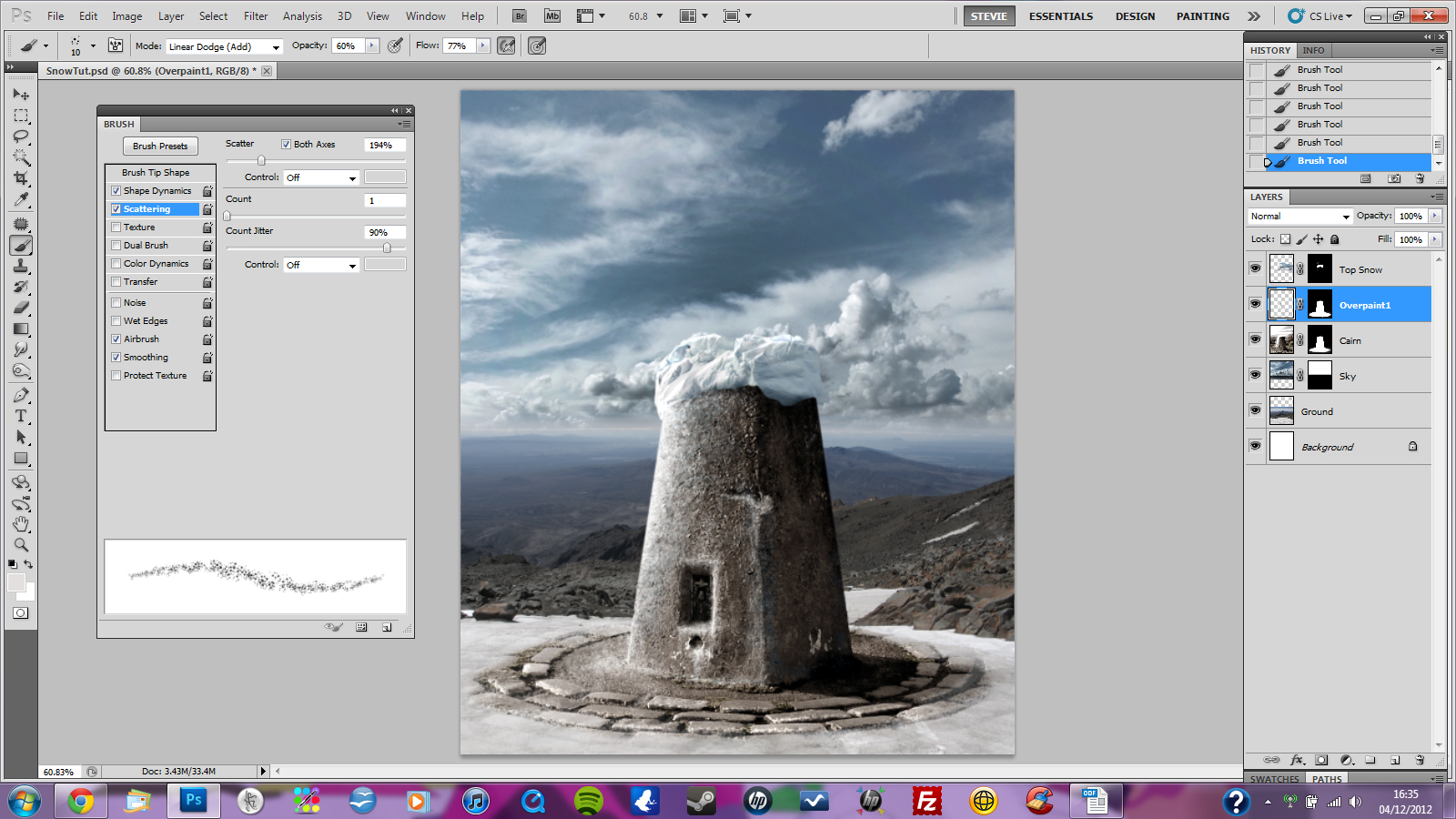
Now comes the tricky part, and there is really no other way to do it than to practice - a lot. This is the detail work - so zoom in. Further. Until your breath dampens the screen... select a basic, soft edged brush. Reduce it down to about 2 pixels, or even 1... and on another new layer, start painting. Sample the underlying source colours as you go for accuracy, and be sure to follow contours naturally - ice flows along natural lines, and drips down occasionally. Vary your brush flow rate, and opacity, and remember that everything is reflective and casts a shadow, too:
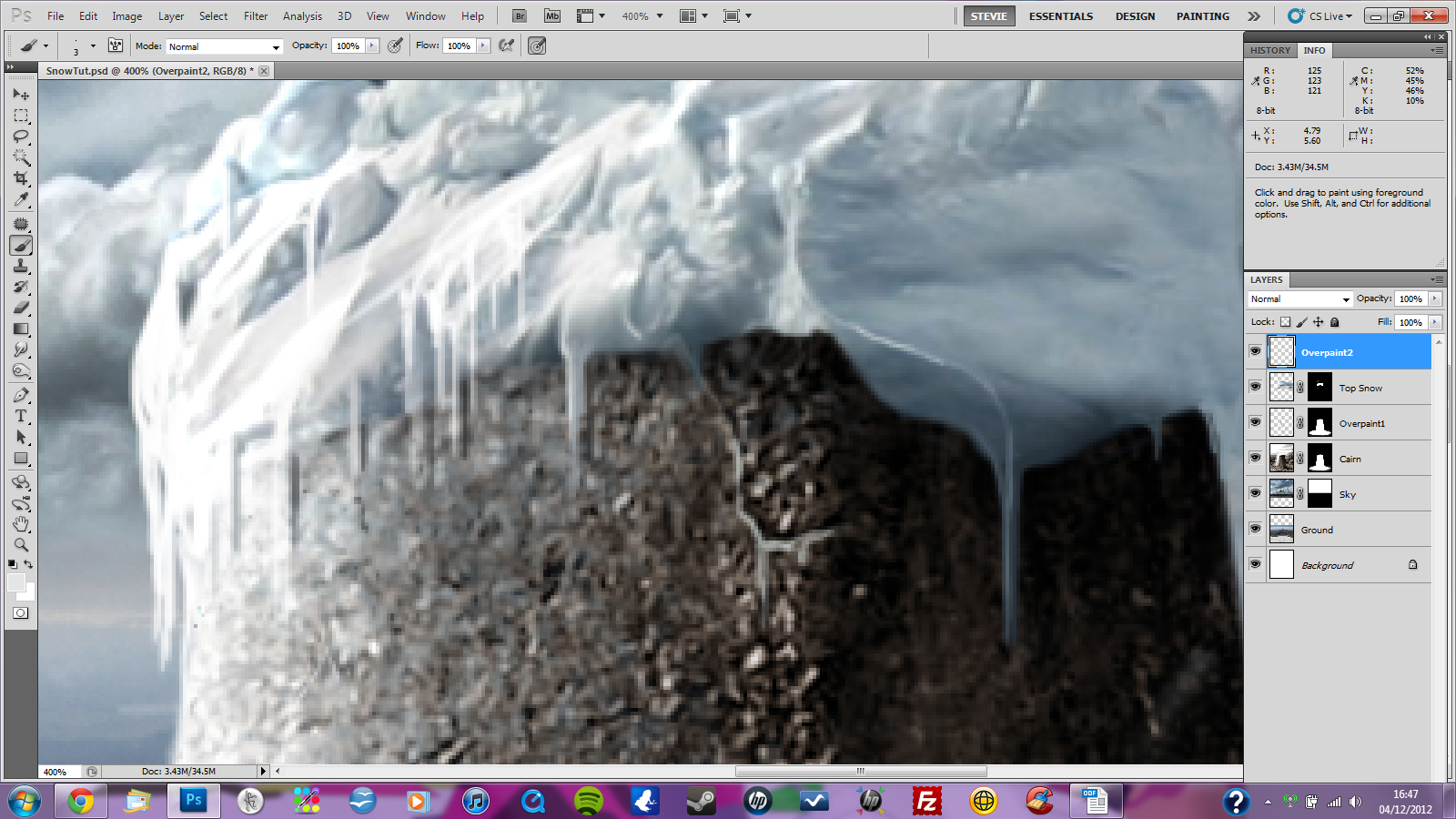
To be honest, this bit takes a lot of work, and hopefully you'll find the patience to practice it until it gets easier. A small tip I use a lot is to hold 'Shift' as you go into a down-stroke with the brush, which will give a nice vertical line. You have to keep zooming in and out, working at it until you're happy with the outcome. It's a fine line - too much, and it ceases to look realistic and photographic and becomes an illustration.
At this stage, I am working on just about all the layers as I go. If I find something not working in the overpaint stage, I correct it on the underlying layers and keep at it. For instance, I noticed very late in the day that I had missed the shadow casting onto the snowy part of the ground:
As it's moving toward being complete, in my mind, this working on all layers to correct and finalise has the effect of tying your image together organically as you work. Here's that shadow I mentioned:
As a final step, a Photo Filter adjustment layer on top of everything has the effect of applying a tone to everything underneath it, which gives that final sense of everything sitting together happily:
You might notice I moved the cloud layer around a little bit, because the white against white was confusing to the eye; and that's another example of letting your work inform its own development as you progress. I loved the composition of the sky at the start, but it didn't serve its purpose in the final outcome, so it had to move...
Little things like that throw themselves up all the time as you work, and for me it's all about letting your image take it's own direction, organically, as you progress. I've never started an image knowing exactly what the outcome will be.
But, if you do the preparation in the correct manner (in this case, getting the right colour tone, temperature, light and shade, masks and groundwork) you can just about always build on that to achieve something outstanding. The devil isn't always in the details - details (in this case, the overpainting) are the fun part where you make your image 'pop', but getting the platform to add them to is the tricky part.
And there we are, a not too startling result, but hopefully it explains the techniques enough that you can produce something more arresting.
Good luck - and remember to practice!
Photoshop tutorial by BonnySaintAndrew originally posted on Worth1000.
Looking for more tutorials, try this one or visit blog.designcrowd.com/tag/tutorial for more helpful hints and tips to boost your designer skills
Written by DesignCrowd on Thursday, March 23, 2017
DesignCrowd is an online marketplace providing logo, website, print and graphic design services by providing access to freelance graphic designers and design studios around the world.
